flame = burning passion.
One of the hardest decisions a company faces after settling on a name is – you guessed it – the logo.
Especially when you're your own designer, client and therefore also your own harshest critic. So after a few rounds of iteration internally, with clients and with IP-savvy friends, “flame” finally won the race as our name (the runner-up that didn't quite make it, incidentally, was “lemon”) – and then it was time to translate the idea behind the name into a visual identity.
For us, flame has always had – and still has – the same core idea: passing on the fire that burns within us, infecting people with our passion for innovation in the broadest sense, and simply getting them genuinely excited. Beyond that, of course, there were content-related aspects we wanted to factor in too. For instance, that fire was one of humanity's very first means of communication (beacon fires, smoke signals and so on), as well as the intimacy of a fireside or campfire for sparking ideas and conversation. And, not least, as a young, innovative company we also wanted to be somehow cool – and above all, ready for the world stage.

So developing our first-ever brand identity was no walk in the park – especially for Boris, who as chief designer was responsible for it. What emerged in the end was a classic wordmark (bold, naturally, because we weren't quite that ourselves yet ;-)) and the flame “F” – nicknamed the Elvis bird (if you don't spot it straight away, we'll help you out ;-)).
The flame wordmark stayed with us (with a few tweaks to the corporate identity along the way) for a full ten years. The signature flame was later added as a visual element, as we moved further into the digital age and new design possibilities opened up (motion design). All in all, our overall look and feel set us up for a very successful start – and quite a bit of expansion besides.
Next step: sleek design.
In the meantime, not only the worlds of marketing and communication had moved on – so had our clients' challenges. Increasingly towards digital communication, mobile first and digital integration along the whole customer journey.
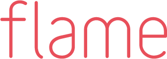
In this environment, we wanted to reinvent ourselves completely. The new flame logo, with its sleek lowercase letters, stood for our ambition to no longer put the company flame front and centre, but instead our team, our range of capabilities, and the work and results we deliver for our clients.
This look, too (with a few iterations along the way), has now served us well for over ten years – until, right on cue for our 20th anniversary, it was time to question ourselves again and think hard about flame's future.
2023. Brand new.
Innovation sits at the centre of everything we do strategically. It's no coincidence that we tend to engage with the future trends of digital transformation in marketing, sales and communication far earlier than most – and bring them to our clients as active input or concrete ideas. That includes immersive technologies like VR/AR, Web3 and, of course, AI. With our new “space & experience” division, we want to show our existing and new clients alike what's possible in digital communication, and find solutions together.
Our new overall brand identity, under the company motto “We burn for innovation”, represents exactly that approach. We're really looking forward to your feedback – and let's see whether this look holds up for another ten years too ;-)

And what fires you up?
Tell us what you’re working on right now — relaxed, over a coffee, virtually or in Munich-Sendling.
Arrange a chat