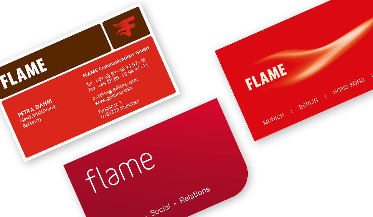
The name’s flame. hello, flame!
One of the most difficult decisions for a company after finding a name is – well, of course, the logo.
Especially when you’re your own designer, customer, and therefore harshest critic. So after a few rounds of iteration internally, with customers and IP-experienced friends, “flame” finally won the race as our name (by the way, the second favorite that didn’t make it in the end was “lemon”) it was time to cast the idea behind the name into a visual identity.
flame = Burning passion.
flame had and still has the same basic idea for us: to pass on the fire that burns within ourselves - to inspire people with our passion - simply to really inspire. Beyond that, however, there were of course aspects of content that we wanted to take into account. For example, that fire was pretty much one of the first means of communication for humans (beacons, smoke signals, etc.) as well as the intimacy of a fireplace or campfire for impulses and conversations. And last but not least, as a young, innovative company, we also wanted to be somehow cool and, above all, internationally "ready".
So developing our first own corporate identity was no walk in the park - especially for Boris, who was responsible for it as chief designer. The result is a classic lettering (of course bold because we weren't at the time 😉 ) and the flame "F" - called: the "Elvis bird" (if you don't recognize it immediately - we're happy to help 😉 ).
The flame logo lettering has accompanied us (with minor adjustments to the corporate identity) for a total of ten years. Later, the obligatory flame was added as a visual element, as we moved increasingly into the digital age and new design possibilities (moving designs) opened up. All in all, our overall presence should help us to get off to a very successful start and to some expansion.


